Role: Independent UX researcher and UI designer
Timeframe: 3 weeks
Overview
I worked on redesigning Vital Outdoors, which is a retail store that specializes in outdoor gear. The store has locations in Golden and Denver. While the store sells great outdoor products, the existing website does not reflect the intents of their overall brand.
The existing website needed some major usability improvements:
– Intuitive user flows
– Better categorization of products
– Layout issues
– Aesthetics
– Easier check out process
– Conciseness
– Intuitive user flows
– Better categorization of products
– Layout issues
– Aesthetics
– Easier check out process
– Conciseness
First Phase
Diagnosing the Problem
The current website of Vital Outdoors does not serve as an easy to navigate or aesthetically pleasing platform to sell their products. The website reflects the opposite of what they say their brand is, which is “A safe and secure environment to browse our product catalog”. The checkout process was confusing and did not evoke trust in the user, which could drive away sales and retention rates.
Proposed solution
Designing a better and easier to navigate website and checkout process that looks aesthetically pleasing would not only reflect the company's branding better, but also drive up sales and evoke a sense of trust in the user.
Research
Competitive analysis
I began my research by looking at other outdoor gear related websites. I looked at how they categorized their products and laid out their check-out process. The websites I looked at were REI, JAX, Feral, and Wilderness exchange. The similarities between these websites were:
– They want their brands featured
– Men and women’s clothing are separated
– Categories of items are differentiated by what the store specializes in; whether it be camping gear, rentals, or clothing
– Men and women’s clothing are separated
– Categories of items are differentiated by what the store specializes in; whether it be camping gear, rentals, or clothing
Vital outdoors had a huge problem with conciseness within their categories, so looking at how these brands navigated their processes' helped me understand how I could redesign Vital Outdoors to be a better eCommerce website with better informational architecture and hierarchy.

User Interviews
I conducted several user interviews to assess how people usually navigate their online shopping experience when it came to buying outdoor-related gear/apparel. This provided helpful information on the behavior of outdoor gear shoppers, such as how often they buy gear and what kind of gear they buy. I interviewed each user and then sorted their answers into categories. The information I gathered from each user helped me prioritize what features I needed to focus on in my redesign of the website.
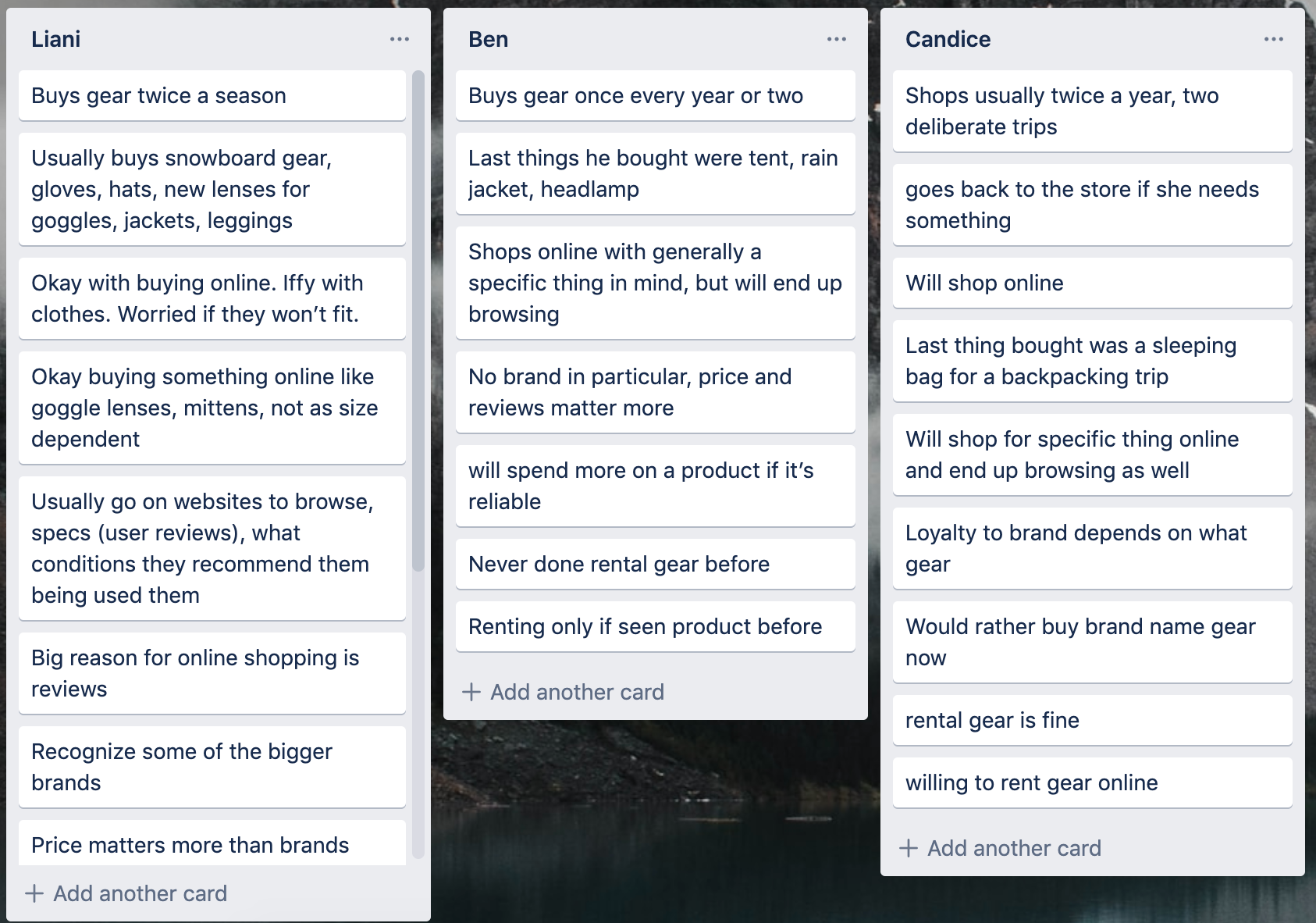
I interviewed peers about their online shopping experiences and habits
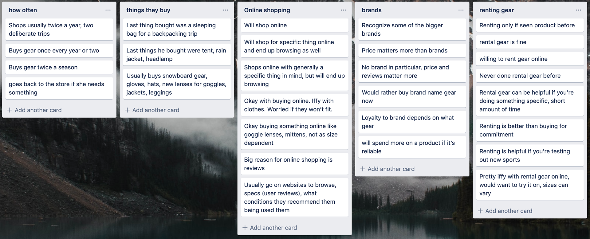
I synthesized their answers, which helped me get a general idea about what people are looking for in their online shopping experiences.
Personas
Meet David, Climber | Colorado Native | Blogger

David's Problem Statement
David is an active outdoorsman who wants the best gear available and to keep up with the current trends.
He wants an easy and hassle free way to purchase the brands that he knows and loves.
David is an active outdoorsman who wants the best gear available and to keep up with the current trends.
He wants an easy and hassle free way to purchase the brands that he knows and loves.
Goals
To buy the best and most effective climbing gear
To keep up with the current trends in outdoor fashion
To get the most satisfaction out of his sends
To get the best outdoor pictures & content for his blog
To someday be sponsored by a brand
Frustrations
Unreliable and cheap gear that breaks or tears
Long lines and crowded stores
Out of stock items that he needs right away
When other people aren't complimenting his sends
Not having the latest and best tech
Solution for David
Provide a website with a clear navigation to brands and other apparel so users can quickly and efficiently access the products they are looking for.
Provide a website with a clear navigation to brands and other apparel so users can quickly and efficiently access the products they are looking for.
Meet Jeremy, Student | Gamer | Shut-in

Problem
Jeremy is an economics student who usually stays inside and plays video games, but recently made some new friends who invited him to go camping.
Since Jeremy is a shut-in and has never bought outdoor gear before, he doesn't know where to start.
Jeremy needs to know what to buy and wants to be sure he is buying the right items for his next trip.
Goals
To start getting outside and exploring Colorado
To be prepared and equipped for his next adventure
To expand his hobbies
To get in better shape
To actually go outside for once and get some vitamin D
Frustrations
Talking to sales people because
Doesn't want to be talked into buying anything he doesn't want to keep
Not sure where to start in terms of buying things
Doesn't want to make a mistake when buying new gear
Solution for Jeremy
New and unsure shoppers need an easy to navigate platform with ratings and reviews of each product so that shoppers can confidently find the gear they are looking for.
New and unsure shoppers need an easy to navigate platform with ratings and reviews of each product so that shoppers can confidently find the gear they are looking for.
Task Flows
Next, I created task flows for each of my personas based on their needs to see how they would each navigate the site to find their desired product. This helped me guide my design into creating an easier and more intuitive flow for the user.
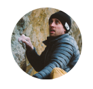
David needs to buy a new Patagonia jacket.
David is an experienced outdoor gear shopper and knows exactly what he wants. Because he has a set jacket in mind, he will go straight from the home page to the Patagonia page and purchase his jacket from there.

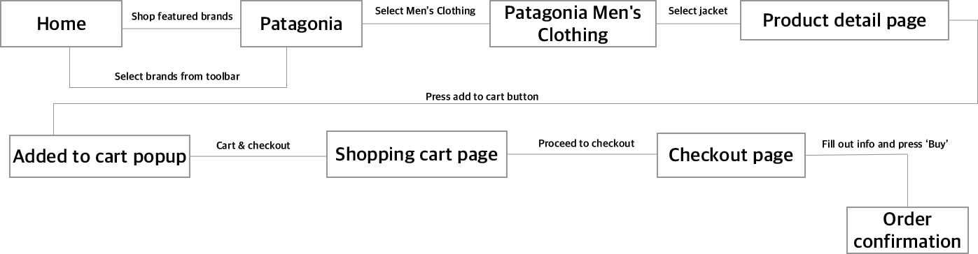
Jeremy needs to buy a sleeping bag for his first camping trip.
Jeremy represents a user who is new to the site. He will use the navigation functions more and will linger more on the product detail page to check out the details and make sure the product is a right fit for him before checkout.
Starting the Design
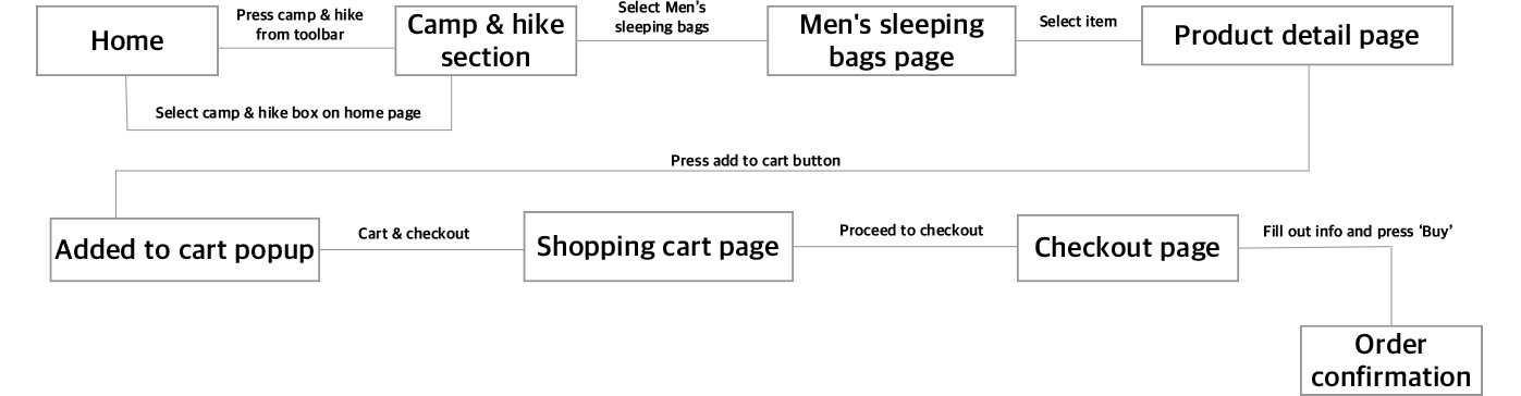
Ideation/Sketching
I began the design process by ideating the different pages of the website through lo-fi wire framing. This helped me create different iterations of the home page, product page, and checkout process.
Bringing the Sketches to Life
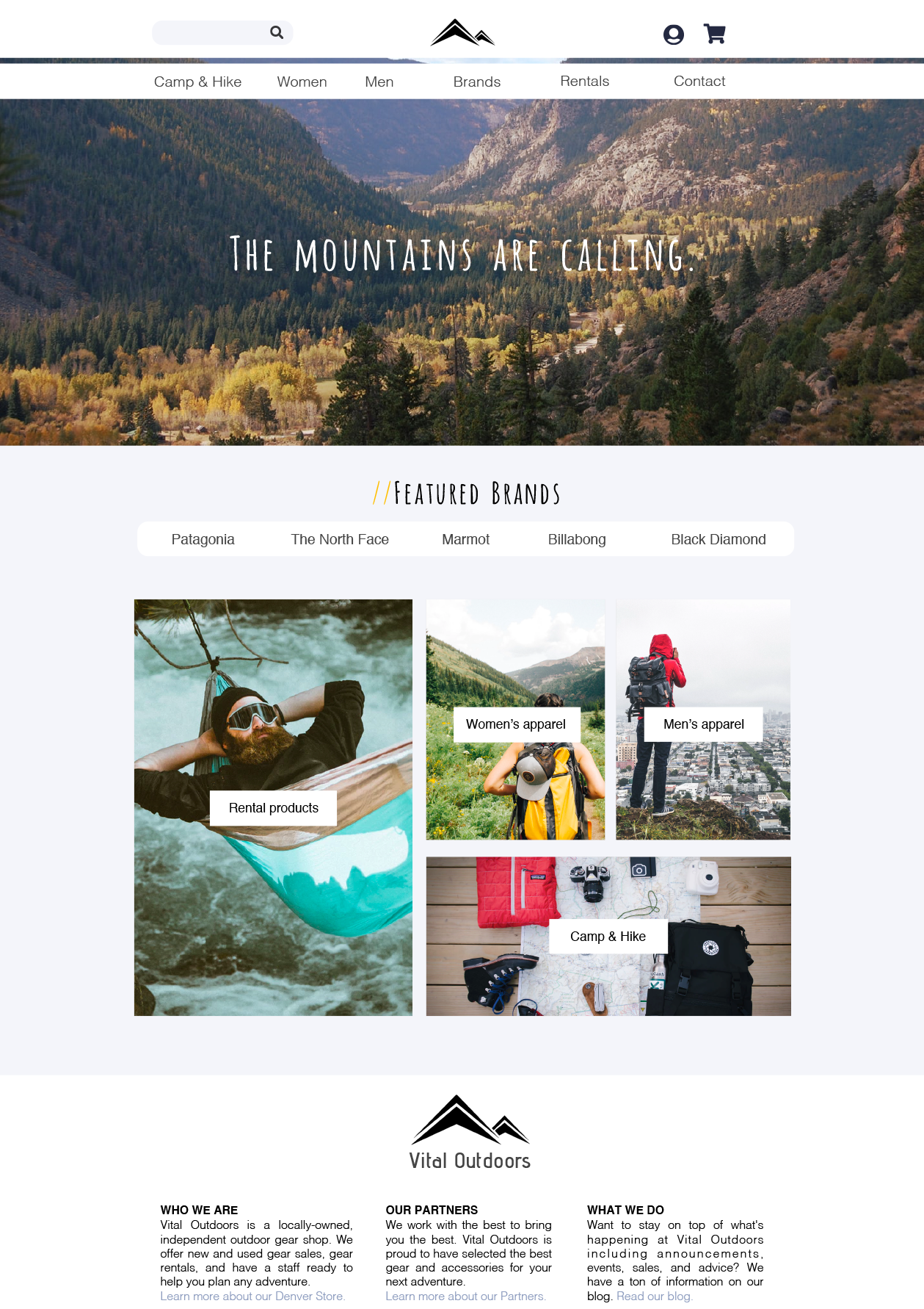
After the lo-fi wireframes, I took my designs into Sketch. With these mid-fi wireframes, my main goals with redesigning the website were to: simplify the homepage, bring attention to the brands they sell, categorize the products they sell in an easy to navigate manner, and simplify the checkout process.
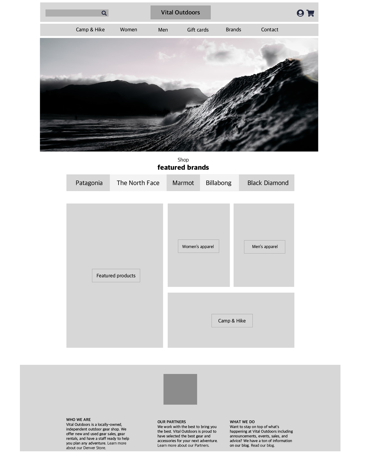
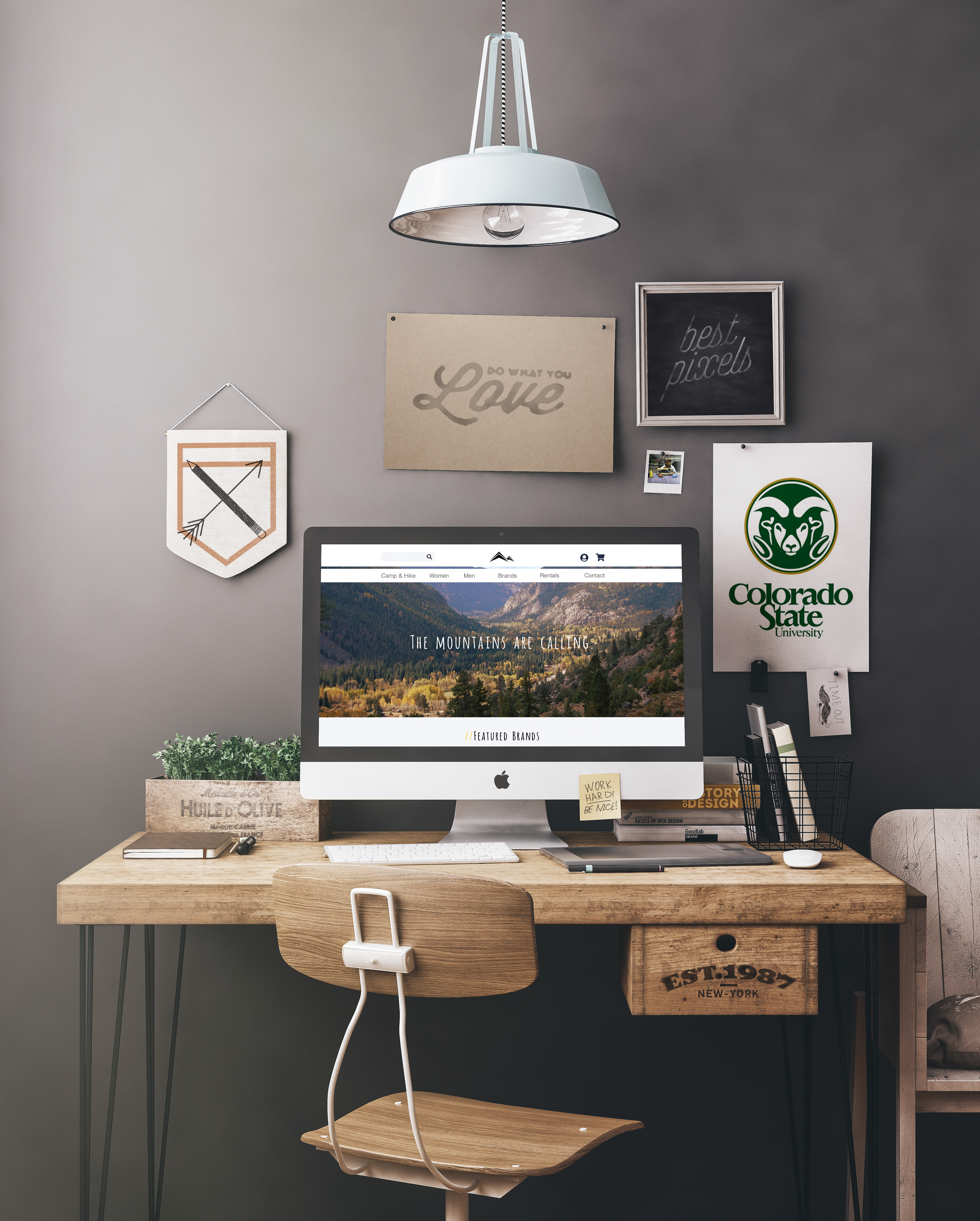
Home page
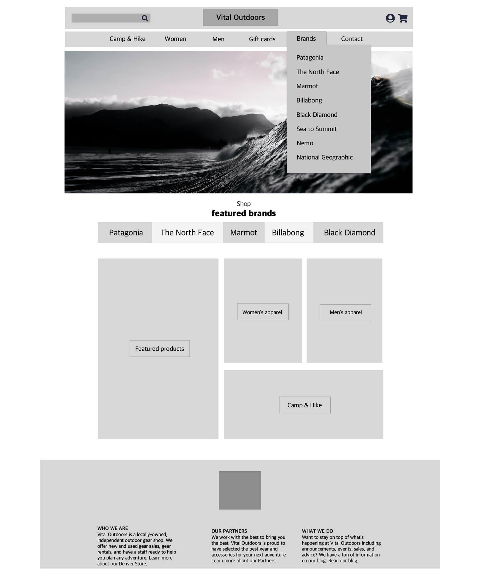
Home page with drop down menu
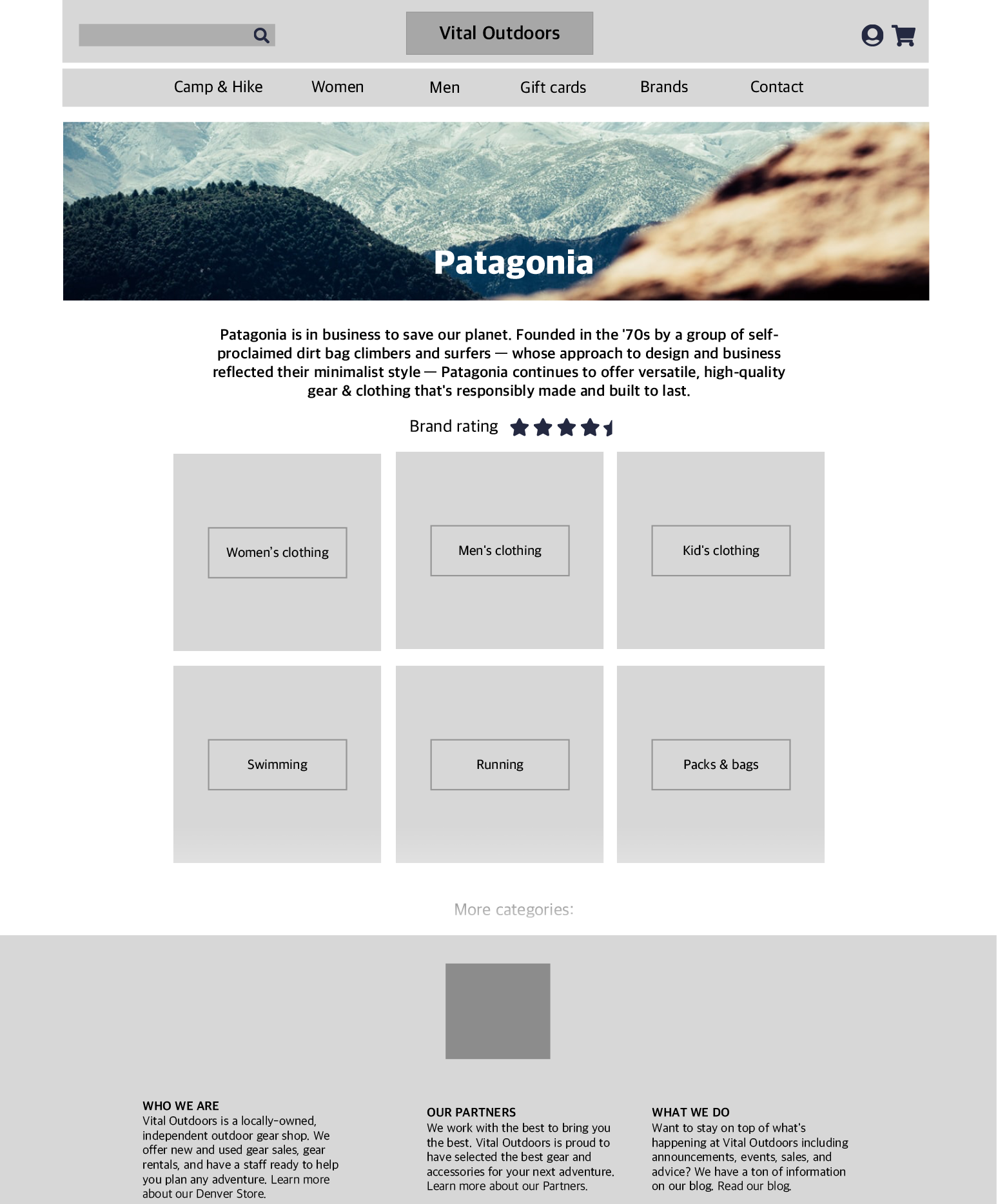
Featured brands page
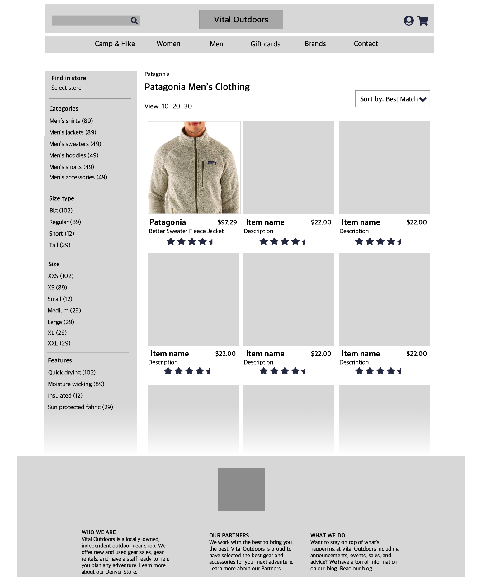
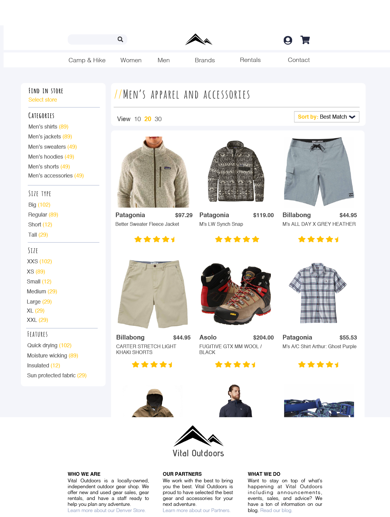
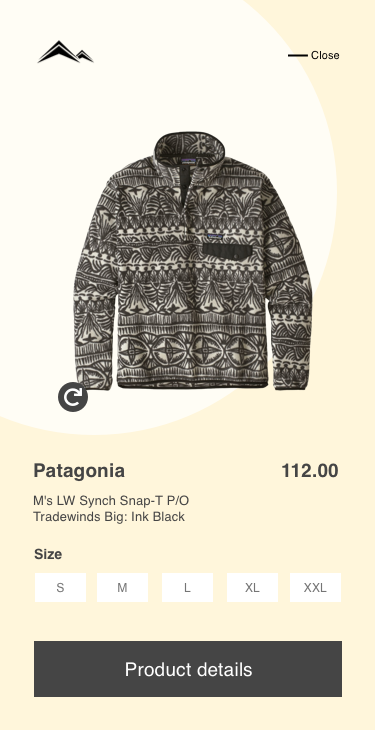
Product Page
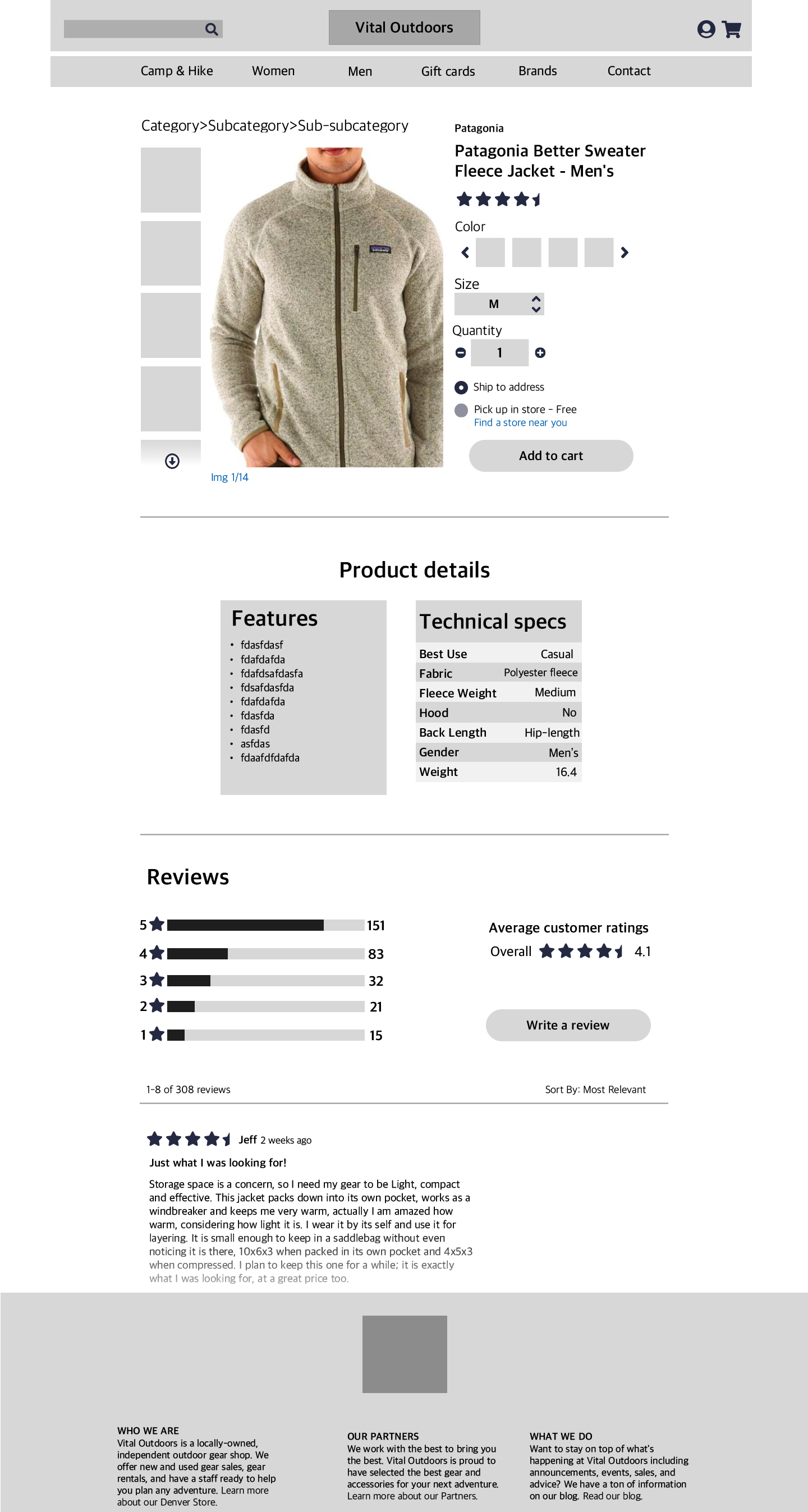
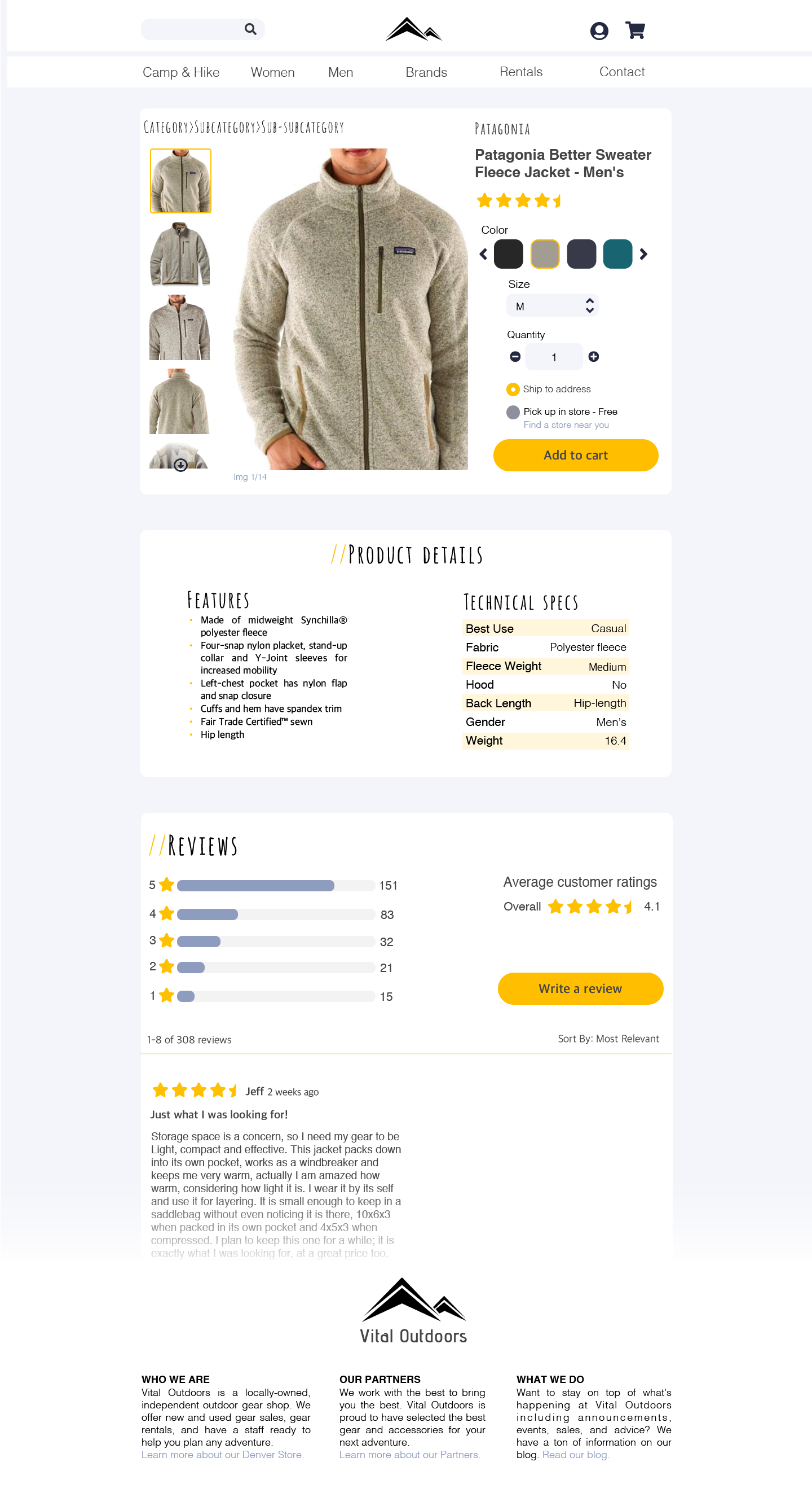
Product detail page
The product detail page features the ability to change quantity, size, and color of the product. Along with features, technical specs, and reviews, the user can thoroughly gauge if the product is right for them.
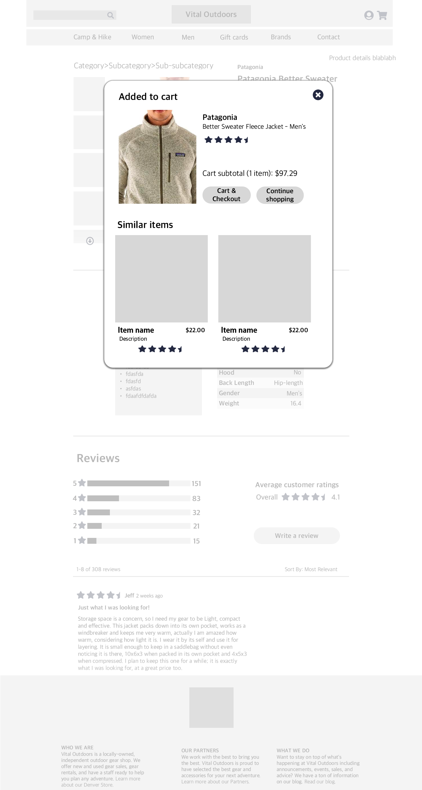
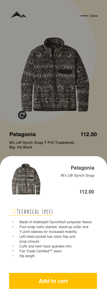
Add to cart popup
Pops up after you click "add to cart"
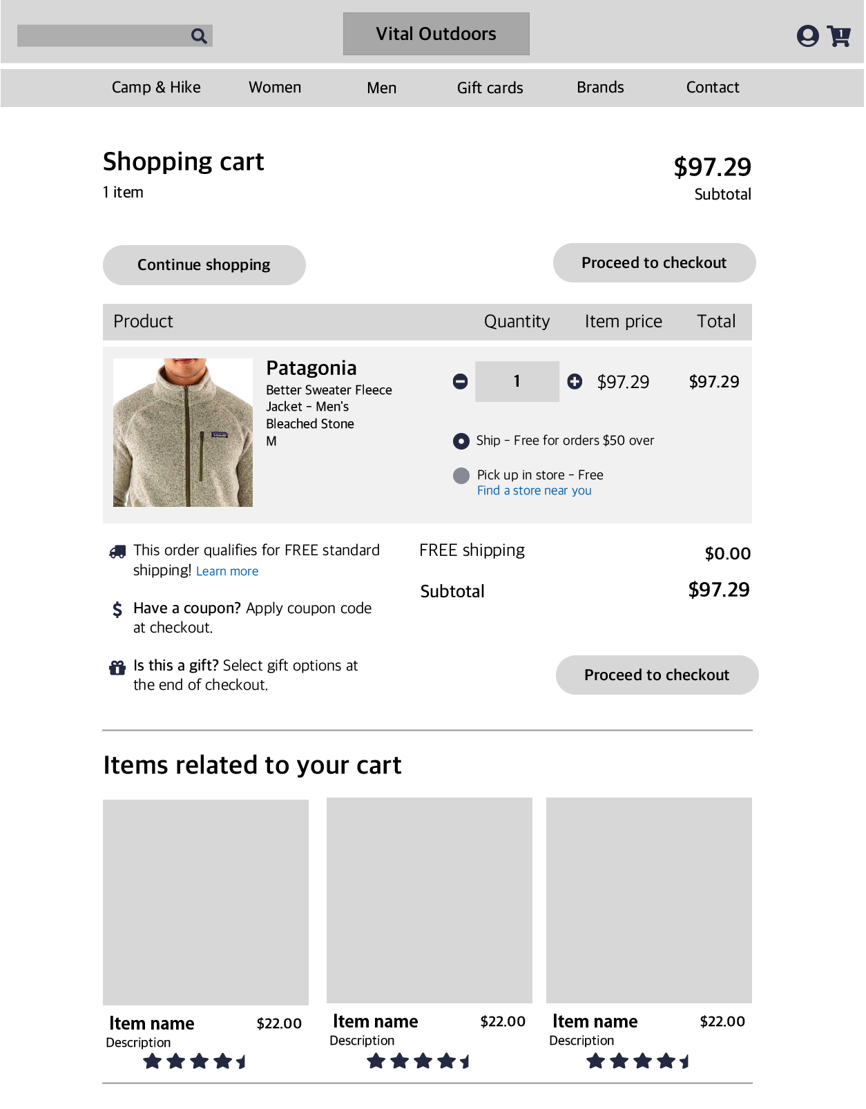
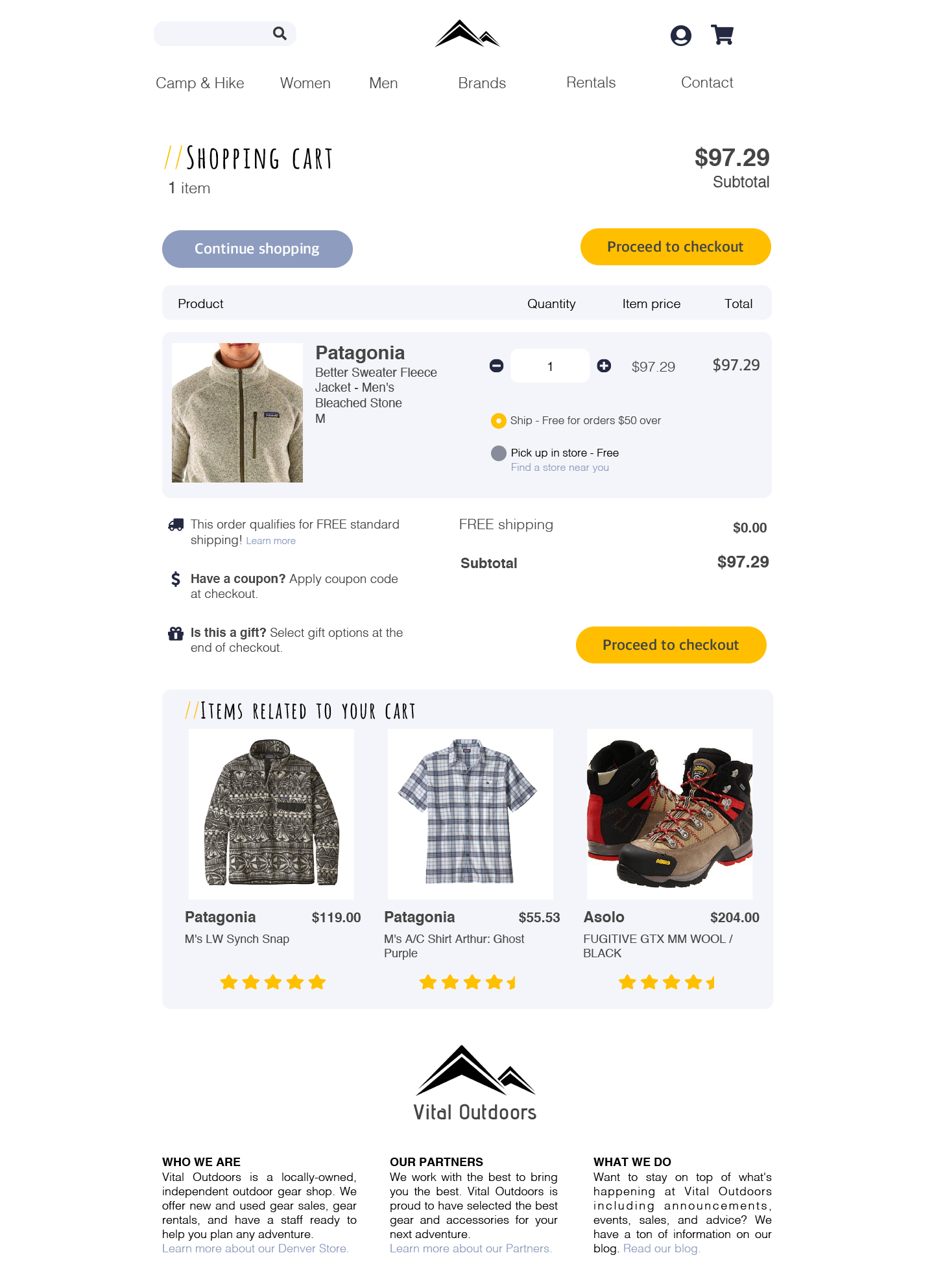
Shopping cart
See what's inside your shopping cart before you check out.
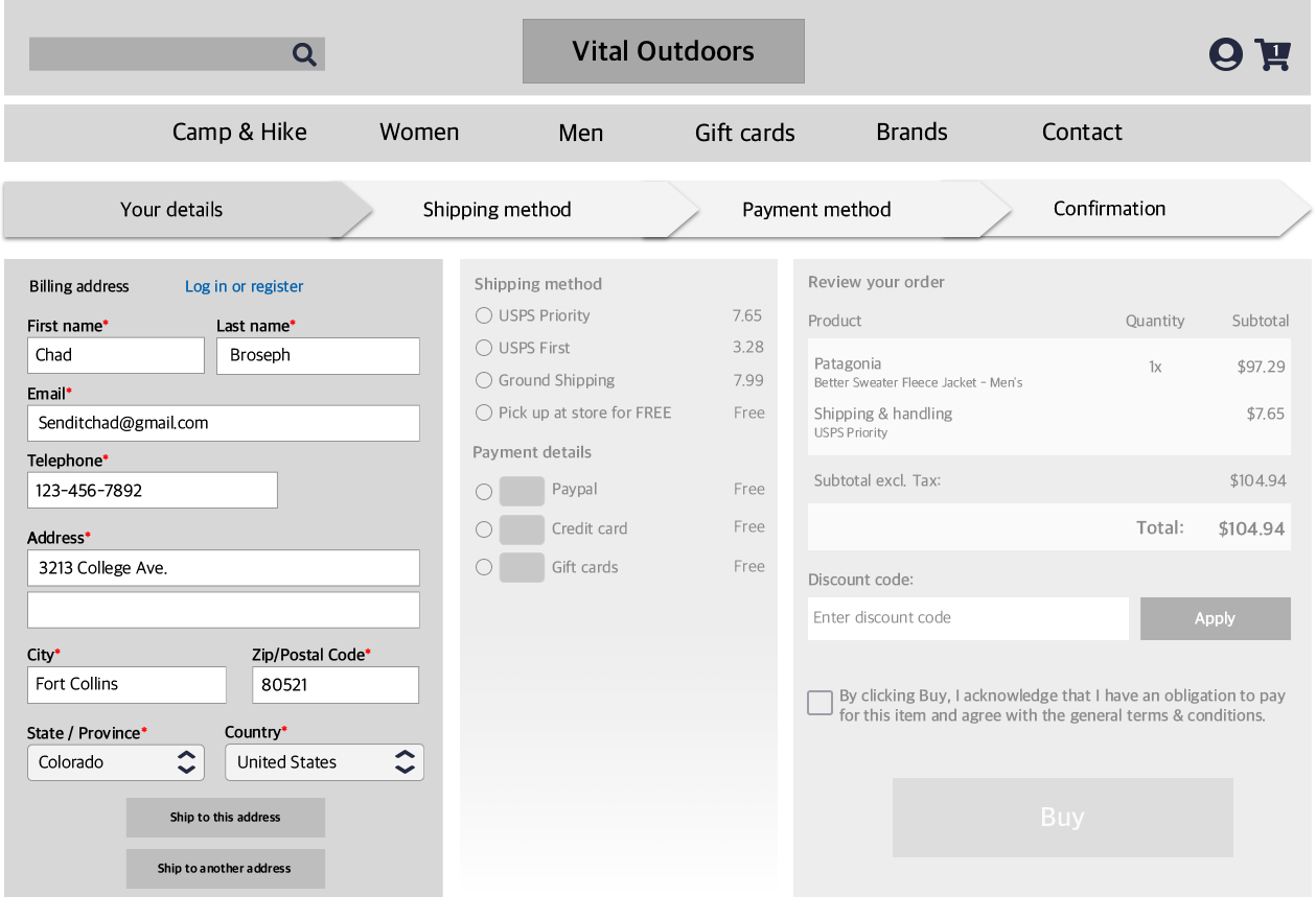
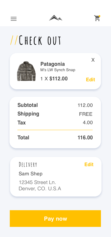
The checkout process
The checkout page is designed to guide the user step by step through the process. The greyed out boxes indicate the user has not completed the section yet, and allows the user to not feel overwhelmed.
Furthering the Design
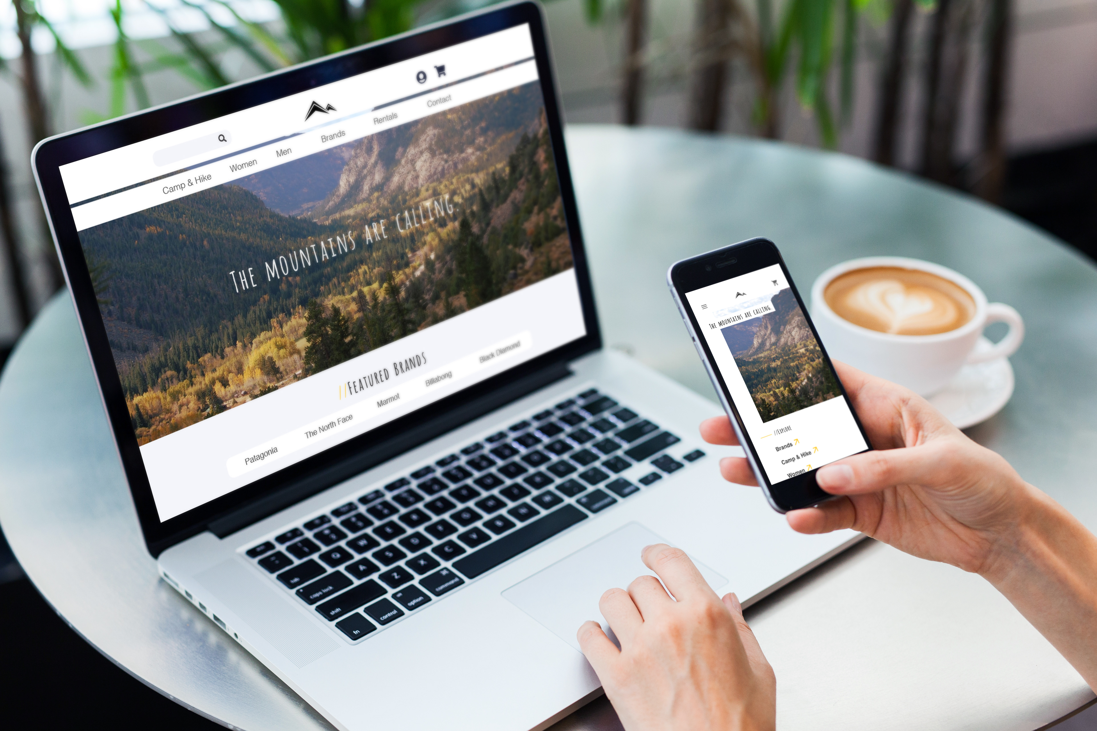
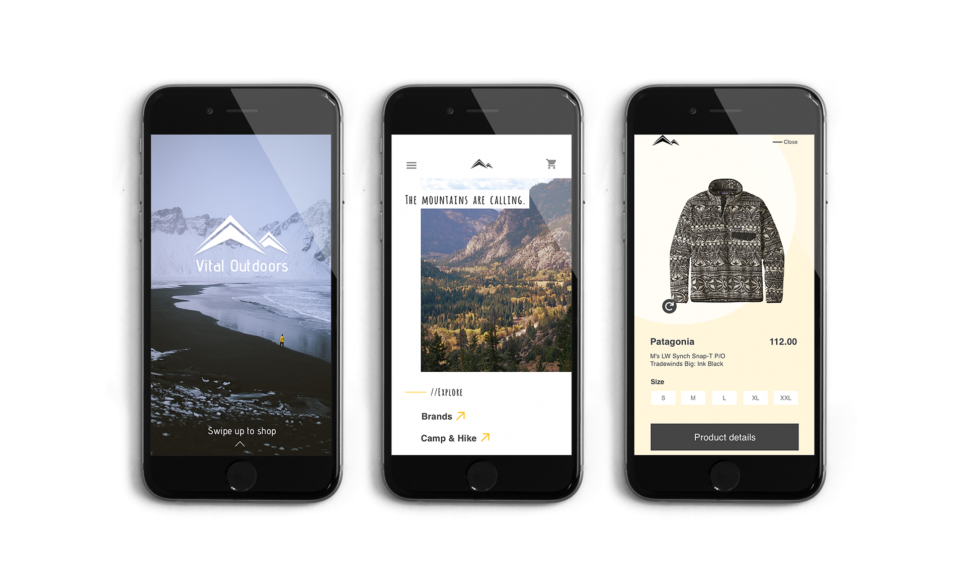
The second phase of redesigning this store began with developing hi-fi mockups of the website and making it mobile responsive.
home page
Product page
Product Detail Page

Add to cart popup
Shopping cart page
Mobile Responsive Application
The second phase of this project consists with bringing the wireframes to life with responsive design.
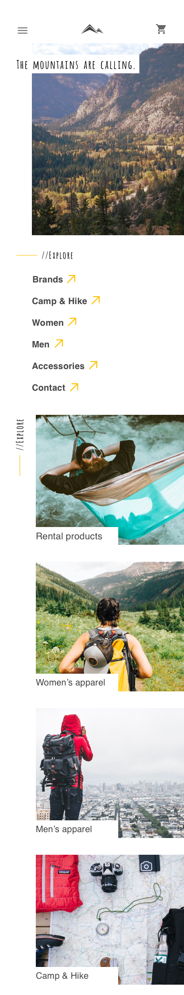
home page
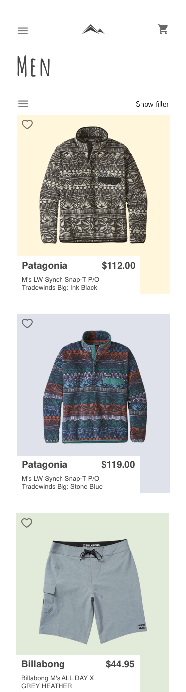
product page
Product detail page
Product detail popup
Check out
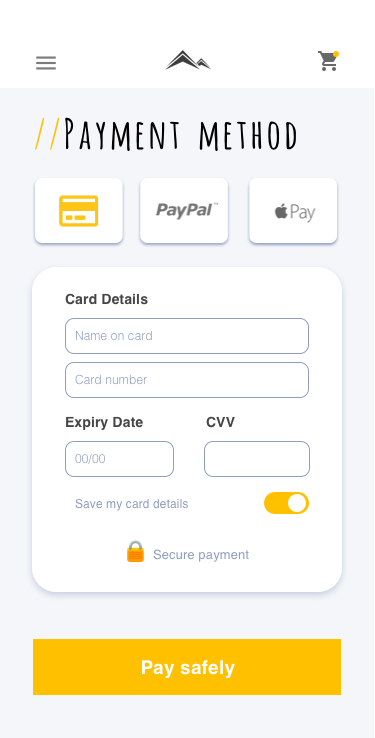
payment method
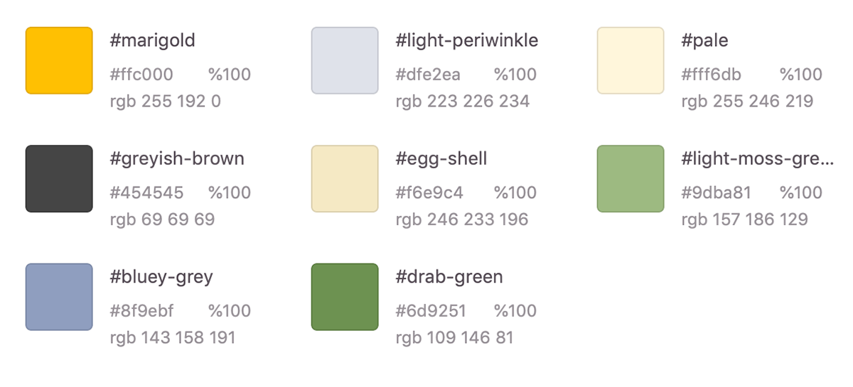
Color Palette
Reflection
Good design is the most effective form of communication. It helps reflects the intent of the company. It shows that the company cares enough to present themselves in the way that most represents them. It evokes a sense of safety, trust, and pleasure in the user. I made it my mission to give Vital Outdoors the design that they deserve.